At some point as an artist, we come across the subject of watermarking artwork to protect it from theft or repurposing. You might already do this as a daily practice.
There are definitely those who disagree with watermarking though. I’ve read articles and seen vids that make the arguments about ruining the viewing experience, and that you’re shouting that your art is worth stealing (ego). Hmm, lots to consider I guess.
I decided to examine watermarking and test out how useful it is by putting my watermarked digital images through some AI services to see if they could easily remove the protection.
What we watermark
There’s plenty of stories online about people working with people who pretend to be customers, are actually scammers and who fake a commission request and steal the work in progress sketches or pre-work. It seems like a smart move to protect the WIP in some way, and also take upfront payments.
When I think about it, we’re not watermarking the actual painting, artwork, sculpture – we’re watermarking the marketing collateral, the images posted online, the proposals etc with the purpose of protecting against theft.
So how do the social platforms do it?
YouTube & others
YouTube provides the option to watermark all of your videos, just by adding a logo / image in your channel settings. I’ve just switched this on in my fledgling channel! It was easy, why not. It’s a very small logo in the bottom right corner, unobtrusive. I don’t mind that.
TikTok, Insta and others add their own watermarks generally in the middle of the image as a white text overlay. It’s clearly visible and placed in a clear space by their AI, yes note how it puts the wording in the clearest space of the image / video.
Here’s how and why I watermark my work
Here’s what I do:
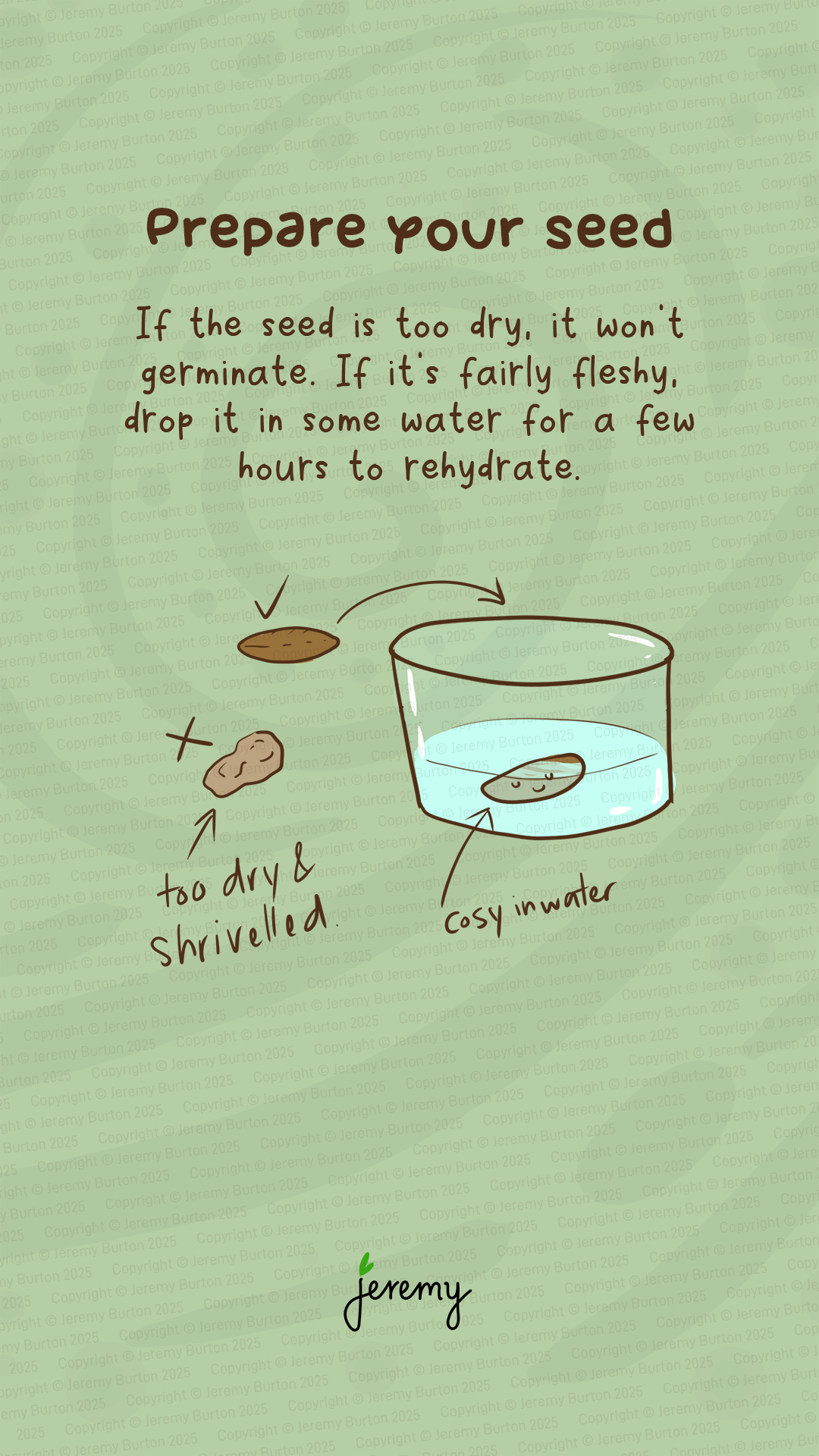
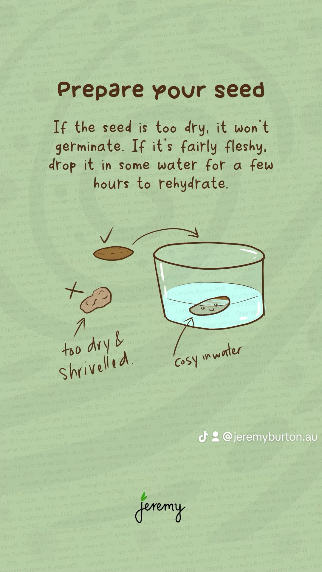
I include my logo for brand purposes, not necessary but that’s my choice at the moment. The main watermark is a full overlay of text across the image. It’s a 9% opacity layer in Photoshop and I reduce it as much as I can to avoid disrupting the experience. Actually now that I take notice of it, it’s pretty visible in this image! I am testing making it even more transparent and less visible in more recent work.
My why
- Copycat sites – I do this because I’ve read too many stories of people having their work copied by automated copy systems like T*mu seems to have in place. I figure, why make it easy for them?
- Future plans – I don’t watermark my photographs and don’t see any need to do those. I can understand the need though if photography is your main trade. With my illustrations, I have multiple plans for and I really don’t want a T*mu or other person enabled to copycat the whole lot really easily. Not that my work is so awesome it would be, but it’s a lot of time invested and future plans for the work are not yet realised.
That’s my why, you may agree or disagree.
A quick overlay method
You can easily add a text or logo overlay in most image editors. Just add a layer over the top and adjust the transparency, placement and size. I use Photoshop and it’s a simple process. My templates have the layers all prepared. Btw some people recommend adding in the word copyright and the © symbol. Although I have it in my watermark overlay, it’s not necessary in my opinion. As creator you have copyright by default if it’s your own work.
Meta data
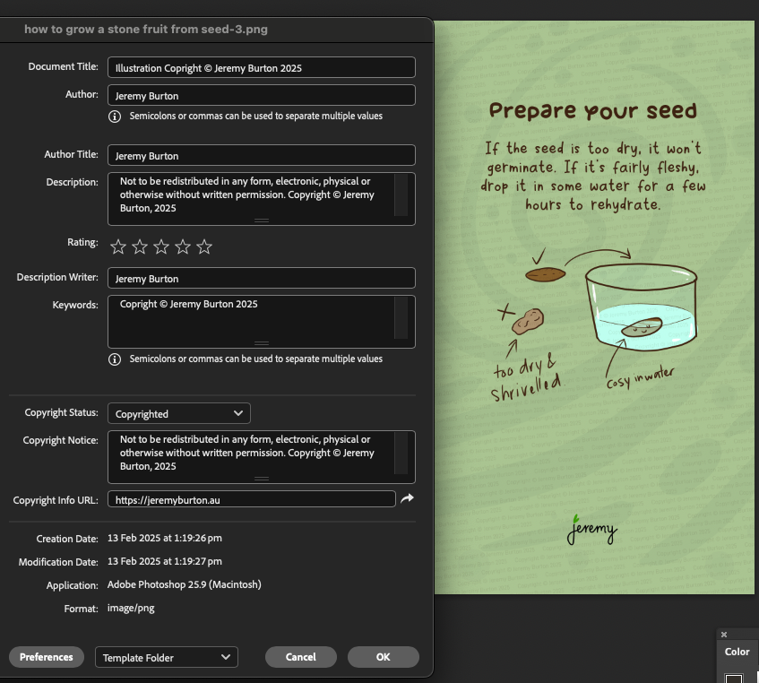
You can also add meta data to your images and videos, tools make it easy. Here’s how I very wrongly fill out my file info in Photoshop. I don’t really worry about it that much, it’s just a template I made and it’ll do! 🙂
Why add meta data? Well, it’s just another way to add digital copyright information to your work. It’s not visible, rather saved within the file.
The meta data is saved with the file, but as you may be aware, meta data is easily removed and for me this is just one more step that’s basically automated (including spelling errors lol, just noticed).
Threads seems to strip out all of the meta data on upload (from memory Facebook does too). If you don’t add in an ALT description when you upload, Threads automatically adds an AI generated description into the HTML.
Why in 2025, the social platforms still do not maintain the meta data of our content, is beyond me.
Testing AI platforms to remove my watermark
I decided to test out some of the AI systems available to reverse engineer my watermarking and see how easy or difficult it was to remove, just out of interest.
I started by chatting with meta.ai that advised me on the platforms to test, btw (funnily enough!) it was a lot more generous with the suggestions after I explained that I was testing my own watermarking. How smart are you.
I tested:
- meta.ai (for advice only)
- Inpaint
- Remini
- Watermarkremover
- Midjourney
Here are some of the test results, and I’m happy to report – they were all hopeless at removing the full image text overlay. I think they would easily remove a logo or single line of white text though. There is AI designed specifically for removing easily identifiable objects in an image / video.
Midjourney AI btw, was just waaaay too creative, lol. Like this is awesome but … maybe my prompts suck?
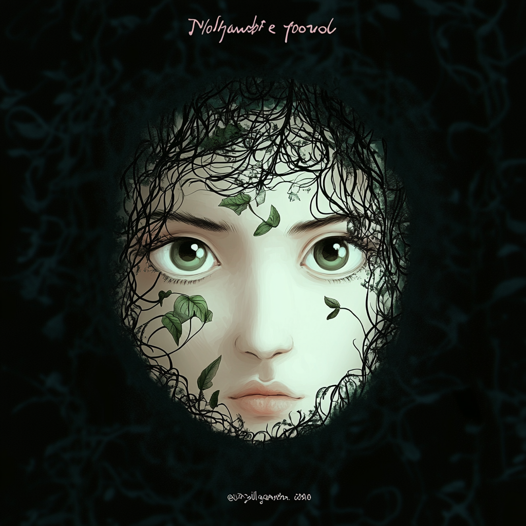
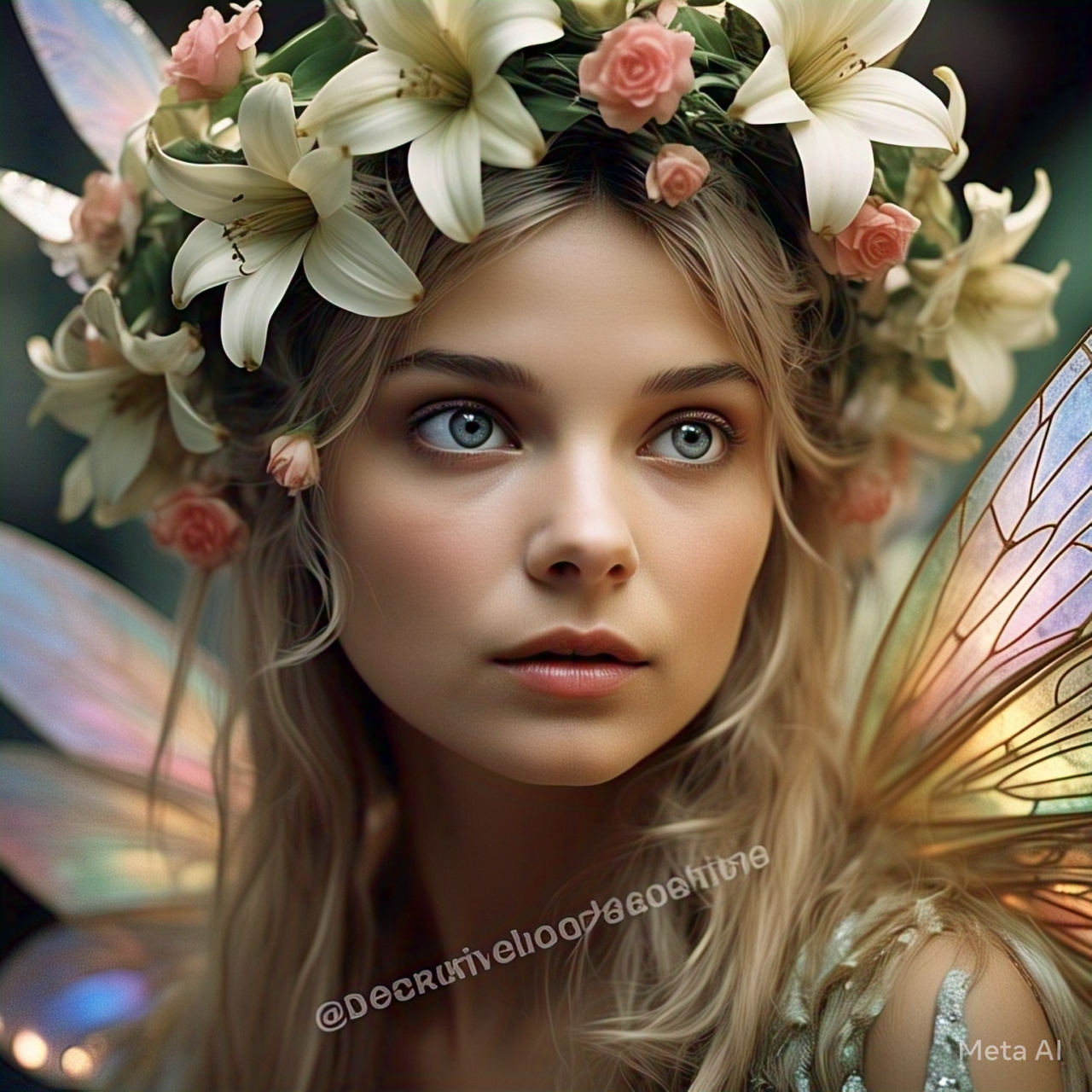
Out of curiosity, I asked meta.ai to watermark a generated image just to see what it did. Even when I badgered it to cover the entire image, all it would produce is this kind of a result.
Redbubble
Redbubble has an automated system that does this, puts crosses or your name through the images. It’s pretty robust, although I was still able to get a 3000 x 3000 pixel sized image out of it (this is my image from my Redbubble account btw), that would be easy-ish to steal and repurpose.
Alternative options
There are lots of alternative ways to do this and here are a few:
- As others have suggested elsewhere, you can partially shoot your art and exclude critical parts
- Capture it from obscure angles
- Use interesting lighting
- Put yourself in front of the art
Isn’t there anything better?
There is an initiative that larger organisations have joined to make a batter way to track content in an age of AI-gen. Check out the Content Authenticity Initiative. It seems a real problem at the moment where some individuals & companies are taking people’s art, putting it through AI and then reselling it as their own (theft).
You can join the initiative as a supporting member here – https://contentauthenticity.org/membership/
It’d be great to have some kind of tracking and authenticity implemented by the AI platform owners.
So what’s the call, should I watermark my digital artwork?
Your call. I choose to use the function on YouTube, it was so easy and saves me having to do anything manually.
In any imagery I create that is to be productised (made into books, merch etc), I use the subtle background text option that seems to win against the AI, for now!
The cute little handle tag in the middle of the image / video is okay too. It’s more like a signature, but it’s very easy to remove though.
I don’t mind a subtle watermark. Let me know your thoughts, do you watermark your work?
Join me on Threads for more or subscribe at the bottom of the page for these posts in your email.