
Your cart is currently empty!
How to feature the newest article from multiple blogs in Shopify
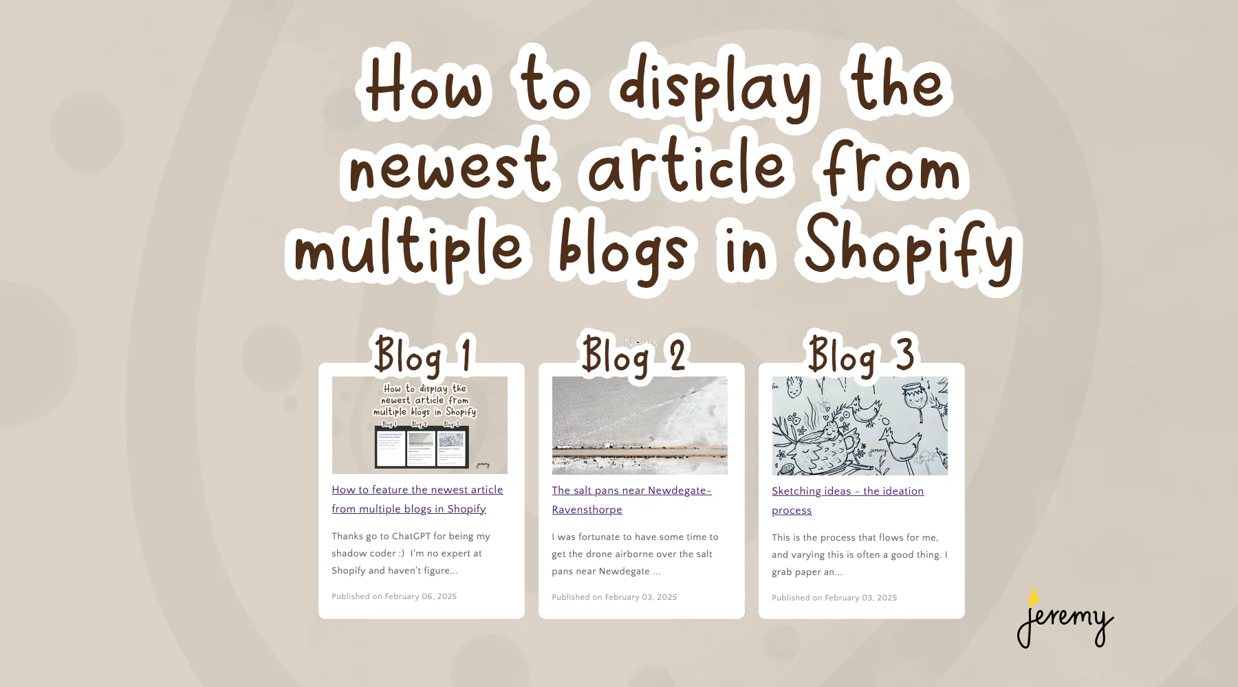
If you’re looking for a way to display multiple blog articles on your Shopify site, this article is for you. Thanks go to ChatGPT for being my shadow coder 🙂 I haven’t figured out how to add a new section template and get it to be available as a option, but with custom code this setup works.
There’s more formatting work to be done, but someone smarter than me might be able to finish this off so it styles the same as the standard blog feature section.
Instructions are:
- Copy this code below
- Edit the blog names (in the code below) to match your blog names. I’ve set them to blogname-1,blogname-2,blogname-3 in the code below. Replace them with yours
- Edit your Theme
- Add a custom code object and
- Paste in your code and save
After doing the above, you should have the first article from each blog displaying on your Shopify site. Enjoy!
P.S. I got a little help from an AI friend to clean up the code.
{{ 'component-slider.css' | asset_url | stylesheet_tag }}
{{ 'component-card.css' | asset_url | stylesheet_tag }}
{{ 'component-article-card.css' | asset_url | stylesheet_tag }}
{{ 'section-featured-blog.css' | asset_url | stylesheet_tag }}

{%- style -%}
.section-{{ section.id }}-padding {
  padding-top: {{ section.settings.padding_top | times: 0.75 | round: 0 }}px;
  padding-bottom: {{ section.settings.padding_bottom | times: 0.75 | round: 0 }}px;
}
@media screen and (min-width: 750px) {
  .section-{{ section.id }}-padding {
    padding-top: {{ section.settings.padding_top }}px;
    padding-bottom: {{ section.settings.padding_bottom }}px;
  }
}
{%- endstyle -%}

{% assign blog_handles = 'news,photography,art' | split: ',' %}

<style>
.featured-blogs {
  padding: 10px;
  border-radius: 8px;
  text-align: center;
}
.featured-blogs h2 {
  font-size: 28px;
  margin-bottom: 20px;
  color: #333;
}
.featured-blogs ul {
  list-style: none;
  padding: 0;
  display: flex;
  flex-wrap: wrap;
  justify-content: center;
  gap: 20px;
}
.featured-blogs li {
  background: white;
  border-radius: 8px;
  box-shadow: 0 4px 8px rgba(0, 0, 0, 0.1);
  padding: 20px;
  width: 300px;
  text-align: left;
  transition: transform 0.2s ease-in-out;
}
.featured-blogs li:hover {
  transform: translateY(-5px);
}
.featured-blogs h3 {
  font-size: 20px;
  margin-bottom: 10px;
}
.featured-blogs h3 a {
  text-decoration: none;
  color: #0073e6;
}
.featured-blogs p {
  font-size: 14px;
  color: #666;
}
.featured-blogs small {
  display: block;
  margin-top: 10px;
  font-size: 12px;
  color: #999;
}
</style>

<div class="featured-blogs section-{{ section.id }}-padding">
  <ul>
    {% for handle in blog_handles %}
      {% assign blog = blogs[handle] %}
      {% if blog.articles.size > 0 %}
        {% assign article = blog.articles.first %}
        <li>
          {% if article.image %}
            <a href="{{ article.url }}">
              <img
                src="{{ article.image | img_url: '255x' }}"
                alt="{{ article.title }}"
                class="motion-reduce"
                loading="lazy"
              >
            </a>
          {% else %}
            <a href="{{ article.url }}">
              <img
                src="{{ 'placeholder-image.jpg' | asset_url }}"
                alt="Placeholder image"
                class="motion-reduce"
                loading="lazy"
              >
            </a>
          {% endif %}
          <h3><a href="{{ article.url }}">{{ article.title }}</a></h3>
          <p>{{ article.excerpt_or_content | strip_html | truncate: 100 }}</p>
          <small>Published on {{ article.published_at | date: '%B %d, %Y' }}</small>
        </li>
      {% endif %}
    {% endfor %}
  </ul>
</div>
---

If you want just a list of the top 5 articles in an UL / LI list, here it is:

---
{% assign blog_handles = 'news,photography,art' | split: ',' %}
{% assign article_count = 0 %}
{% assign max_articles = 5 %}

<div class="featured-blogs section-{{ section.id }}-padding">
  <h2>Latest Articles</h2>
  <ul>
    {% for handle in blog_handles %}
      {% assign blog = blogs[handle] %}
      {% for article in blog.articles %}
        <li>
          <a href="{{ article.url }}">{{ article.title }}</a>
        </li>
        {% assign article_count = article_count | plus: 1 %}
        {% if article_count >= max_articles %}
          {% break %}
        {% endif %}
      {% endfor %}
      {% if article_count >= max_articles %}
        {% break %}
      {% endif %}
    {% endfor %}
  </ul>
</div>

----
Hope you found this useful! Leave a comment if you have a feedback.


Leave a Reply
You must be logged in to post a comment.